Colour in Practice
An exploration of how colour, light and shadow shape atmosphere - using restraint, contrast and moments of saturation to bring depth, clarity and delight to architectural space.

Moments of Saturation
Colour plays a careful and considered role in our work – rarely applied as surface decoration only, but used as a tool to shape atmosphere, rhythm and experience. While restraint is often important, neutrality doesn’t need to be the default. Colour has the capacity to create drama and delight, and to shape how spaces are felt as much as how they are seen.
Colour can help define thresholds, guide movement and bring focus to particular areas and uses within a scheme. It can amplify light, soften transitions between old and new, or give a small space a strong identity. Used well, colour becomes part of the architecture.
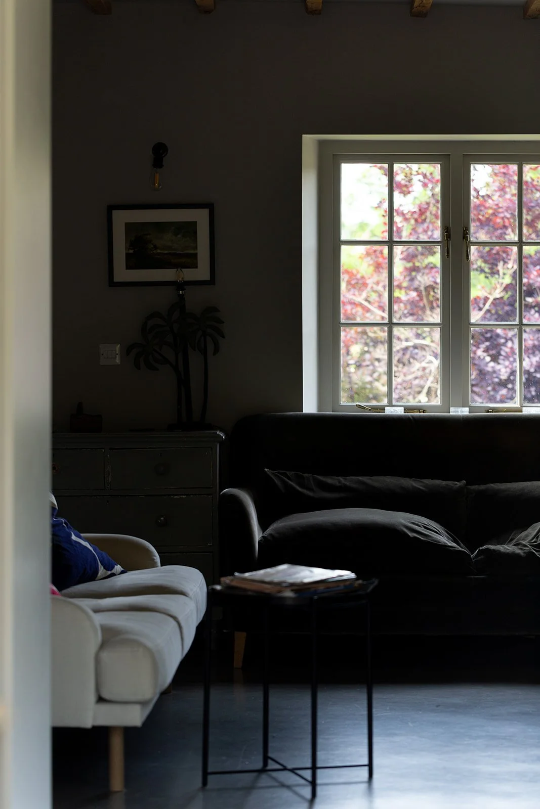
The relationship between colour, light and shadow is particular interesting. In In Praise of Shadows, Japanese author Jun’ichirō Tanizaki argues in favour of darkness over bright, sterile spaces. He argues that colour is inseparable from shadow and, crucially, that it should be subservient to it:
“We do our walls in neutral colors so that the sad, fragile, dying rays can sink into absolute repose.… We delight in the mere sight of the delicate glow of fading rays clinging to the surface of a dusky wall, there to live out what little life remains to them.”
For him, the power lies in the variation of the shadow, not in colour:
“When we gaze into the darkness that gathers behind the crossbeam, around the flower vase, beneath the shelves, though we know perfectly well it is mere shadow, we are overcome with the feeling that in this small corner of the atmosphere there reigns complete and utter silence; that here in the darkness immutable tranquility holds sway.”
Tanizaki was writing In Praise of Shadows in 1933, at a moment when the principles of Modernist architecture had become the dominant framework for Western architectural thinking. Where Modernism sought openness, clarity and light, Tanizaki argued for murkiness.
“… it is apparent that they [Western houses] are built to create as few shadows as possible and to expose the interior to as much light as possible.… The quality that we call beauty, however, must always grow from the realities of life, and our ancestors, forced to live in dark rooms, presently came to discover beauty in shadows, ultimately to guide shadows towards beauty's ends. And so it has come to be that the beauty of a Japanese room depends on a variation of shadows, heavy shadows against light shadows - it has nothing else.”
His observations point to an understanding of colour not as something fixed or absolute but as changeable and contingent. Colour can be discovered slowly - delicate differences in hue revealed as sunlight moves through a room – but it can also reveal itself suddenly and unexpectedly.
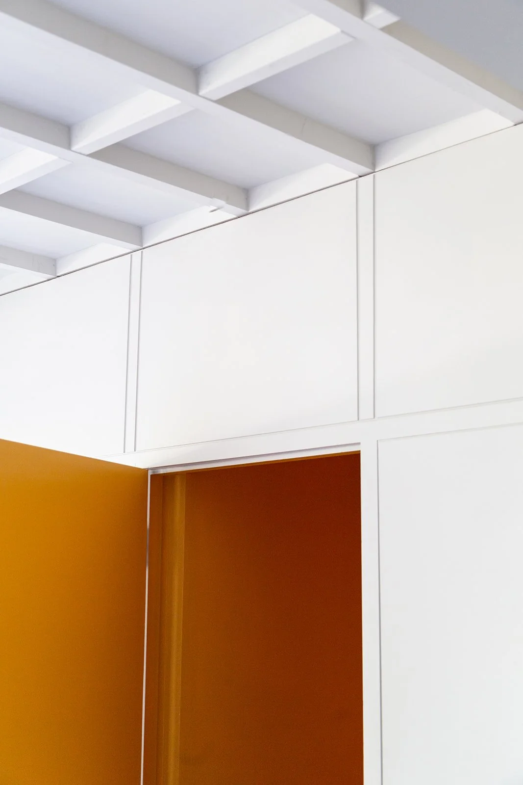
One recurring approach in our projects is the use of restrained palettes punctuated by moments of saturation. These moments are deliberate: a floor that reflects light deeper into a space, a surface that signals a shift in function, or a deep hue that encourages the body to slow down as a threshold is crossed.
This can be seen our The Architect’s Cottage project, where colour is used selectively to articulate spaces within a historic building. Here the walls and floors of the new extension are both painted in Ammonite - a subtle, understated pale grey by Farrow & Ball that complements the poured concrete floor. Within this calm backdrop, the small WC is then entirely saturated in Dutch Orange. When the door is opened, the citrus bright of the space within is surprising and intense - a deliberate counterpoint to the otherwise quiet interior of the 18th Century gritstone cottage.
View The Architect’s Cottage project →

Project updates, news and details from SJW Architects.
Latest Posts


